1The Problem
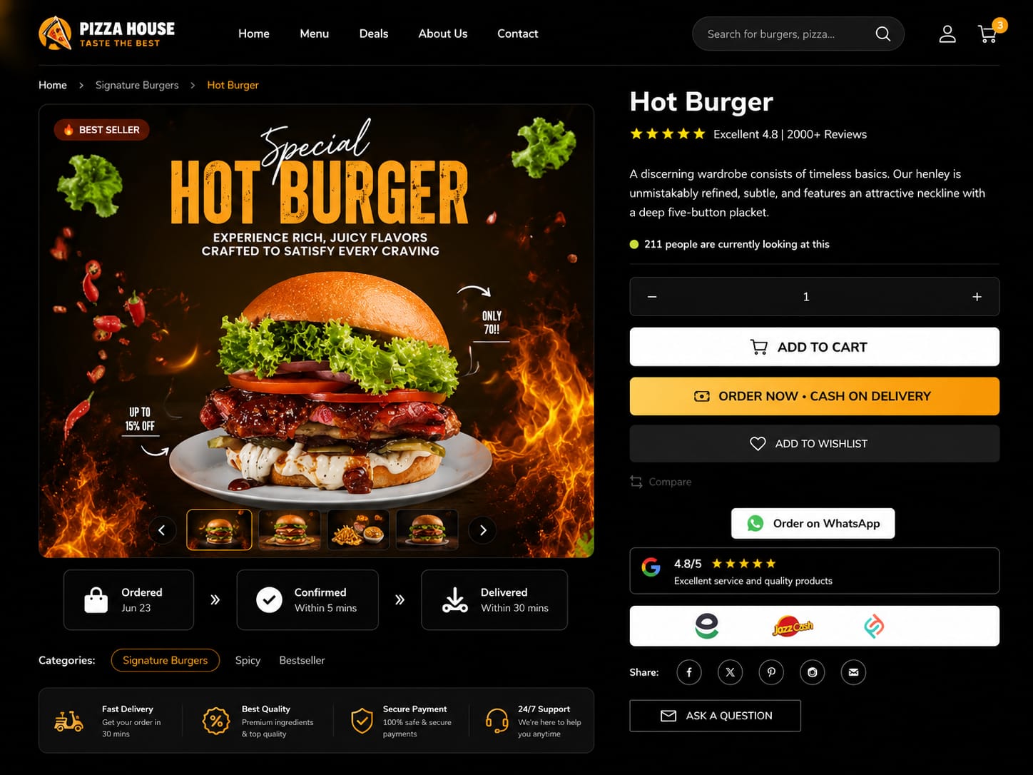
Umair's brand sells a premium dining experience, but the product page didn't feel premium. Images were small, the description was a wall of text, the price sat next to a cluttered sidebar, and the add-to-cart button competed with five other links. High-ticket buyers need confidence before they spend, and nothing on that page was building it.
2How I Solved It
I redesigned the page as a guided journey rather than a spec sheet. Large editorial photography leads, the story is broken into short scannable blocks with generous whitespace, and every distraction around the buy area was removed so a single call-to-action owns that space. I set a typographic hierarchy that reads as refined rather than loud, added quick-view detail cards so buyers can check materials and specifics without leaving the page, and rebuilt the mobile layout so the price and add-to-cart stay reachable while scrolling. The point was to make the page feel as considered as the product itself.