1The Problem
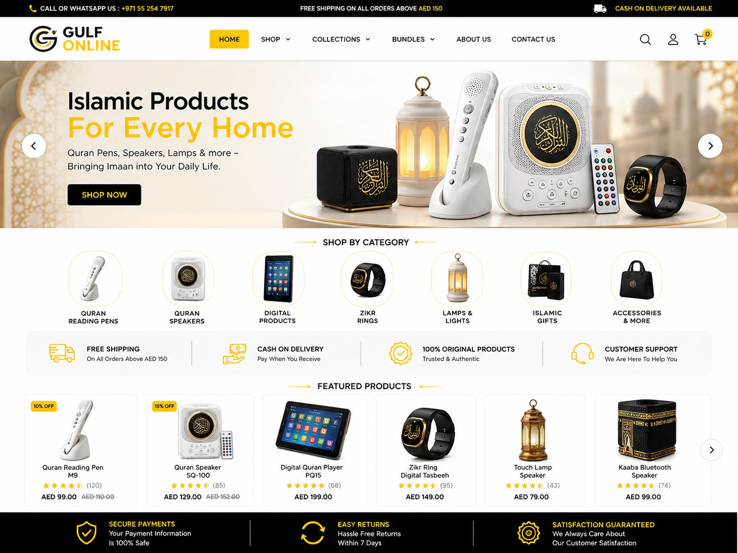
Gulf Online Store had products but no identity. The homepage was a default theme with a stock banner, no reason to trust the brand, and no clear next step — visitors from Dubai ads were landing, scrolling once and bouncing. The checkout also added surprise steps at the end, which is exactly where people abandon a cart.
2How I Solved It
I started with the brand: a consistent colour system, typography and iconography so the store looked like a real Gulf retailer instead of a dropshipping template. Then I rebuilt the homepage as a funnel — a hero with one honest value proposition, a feature grid that answers 'why buy here', real customer testimonials and ratings for social proof, and a sticky call-to-action that follows the user down the page. For checkout, I removed every optional field, surfaced shipping and delivery time before the payment step so there are no surprises, and tested the whole flow on a mid-range Android phone, because that's what most of his customers actually use.